Descriptive Statistics

Descriptive Statistics
In this article you will learn about descriptive statistics where basically you will learn how to summarize and organize data. Specifically under organization and summarization of data you will learn about organizing and summarizing data using tables and graphs.
In the article you will also specifically learn about summarizing data using numerical summaries like measures of centre, location and dispersion. The article is important as it
provides you preminary data analysis tools before carrying out inferential statistics.
Basic Statistical Terms
- Data consists of information coming from observations, counts, measurements, or responses. The singular of data is datum or data point.
- Statistics is the science of collection, organizing, analyzing and interpreting data in order to make decisions.
- A population is a collection of all items of interest in the study. For example, lets say you want to find out the mean height of statistics class, then the population include all students in the statistics class.
- A sample is a subset of a population. For example, to measure heights of students in the statistics class, we may not measure everyone probably due to time; so we take a subset of students. This subset is the sample.
- A parameter is a numerical description of a population characteristic. Examples include population mean which describe population center and population standard deviation which describe population variation.
- A statistic is a numerical description of a sample characteristic. Examples include sample mean describing sample centre and sample standard deviation which describe how sample values vary.
- Descriptive Statistics is the branch of statistics that involves the organization, summarization, and display of data.
- Inferential statistics is the branch of statistics that involves using a sample to draw conclusions about a population. Some of the problems concerned in inferential statistics are those of estimation and hypothesis testing.
- Data types: There are two types of data
- Qualitative and quantitative
- Qualitative data is non numeric data and is usually treated as categorical data.
This means the observed data values can be put into categories.
Examples of qualitative/categorical data include: gender data(male/female)
- Quantitative data is numeric data that arises from frequencies or measurements.
There are two types of quantitative data:
- Discrete and continuous
-Discrete Data: the data are said to be discrete if the measurements are integers (e.g. number of employees of a company, number of incorrect answers on a test, number of participants in a program, etc).
- Continuous Data: the data are said to be continuous if the measurements can take on any value, usually within some range (e.g. weight, age, income etc).
Summary of data using tables
A frequency table: is a list of possible values and their frequencies. It is used to summarize categorical data into tables to see frequency distribution for each category
Example
Group internet use data into group frequency table 7,7,11,17,17,18,19,20,21,22,23,28,29,29,30,30,31,31,33,34,36,37,39,39,39,40,41,41,42,44,44,46,50,51,53,54,54,56,56,56,59,62,67,69,72,73,77,78,80,88
Step 1: Find Range = Largest observation – Smallest observation
=88-7
=81.
Step 2: Find class width by dividing the range by the number of classes: Class width
≈Range/number of classes
Number of classes
A rule of thumb for the number of classes is √n. E.g number of classes =√50=7.0 71068
Thus class width ≈ Range/Number of classes = (88–7)/7=11.57 rounding up gives a class width of 12.
Step 3: Find class boundaries starting from lowest observation and adding class width to find upper limit. This gives boundaries of 7, 19, 31, 43, 55, 67, 79, and 91
NOTE: We will have the classes running from 7 to 19, etc where the upper bound is exclusive, i.e it does not include 19
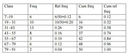
Step 3: For each class, count the number of observations that fall in that class. This number is called the class frequency.
Step 4: The relative frequency of a class is calculated by f/n where f is the frequency of the class and n is the number of observations in the data set.
Step 5: Find the cumulative frequency and cumulative relative cumulative frequency.
Graphical Summary of Data
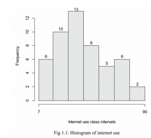
Histogram
A histogram displays the frequency distribution of a quantitative variable by showing the frequency (count) or percent of the values that are in various classes.
The classes are typically intervals of numbers that cover the full range of the variable.
Histograms are used to assess the distribution of the quantitative variable.
To construct a histogram, group the data into a frequency table, i.e. put data into classes, and determine frequency for each class.
Plot class frequency against class intervals to have a histogram.
Shapes of the histograms
(a) Normal (symmetric)
A histogram has bell shape.
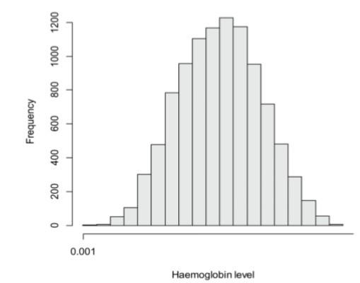
Fig 1.2: Normal shape of a histogram
The normal shape of histogram means that most data is clustered in the centre.
(b) Skewed (asymmetric)
The distribution’s peak is off center and a tail stretches away from it.
These distributions are called right or left-skewed according to the direction of the tail.
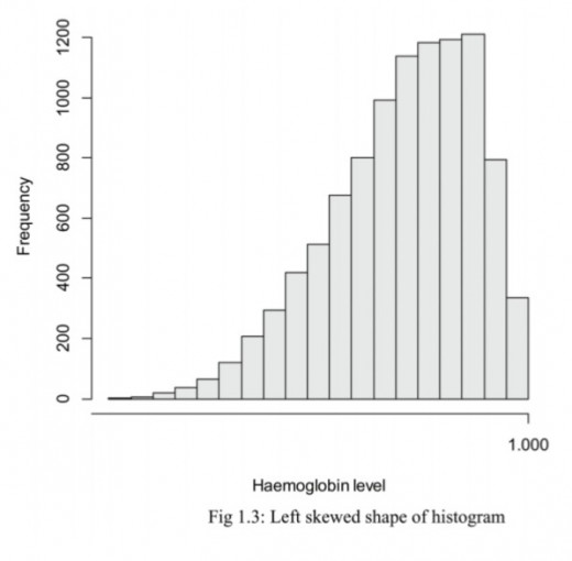
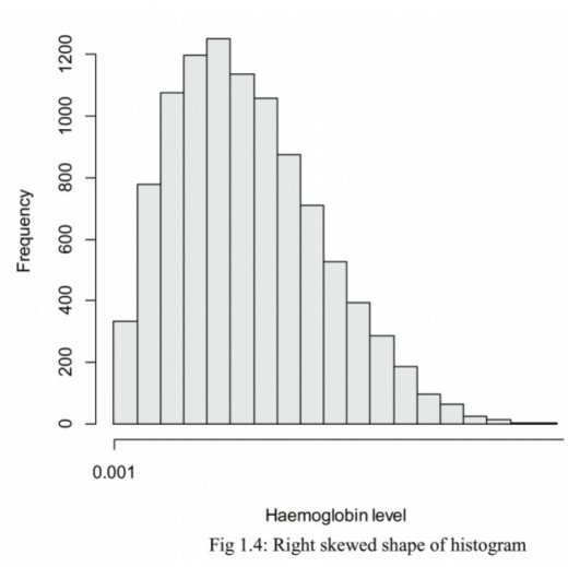
In the right skewed distribution it means most data is to the left and in the left skewed distribution it means most data is to the right.
(c) Bimodal
The bimodal distribution looks like the back of a two-humped camel.
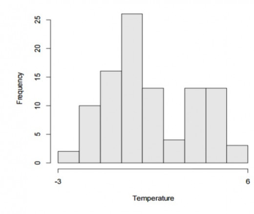
Fig 1.5: Bimodal shape of histogram
The bimodal distribution means that the data come from two district populations.
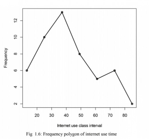
Frequency polygon
Is a line graph plotted by plotting frequency against class interval. It shows frequency distribution of classes by a line graph. For example the frequency polygon for internet use data is as shown below:
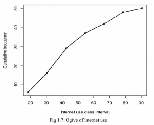
Ogive
Is a plot of cumulative frequency versus class intervals. The diagram below shows an ogive for internet use data.
Stem and leaf diagram
It is used to display the frequency distribution of quantitative data by showing actual data rather than frequencies.
Example
Draw stem and leaf diagram for the students scores:
35, 36, 38, 40, 42, 42, 44, 45, 45, 47, 48, 49, 50, 50, 50.
Solution
Range: 35 to 50
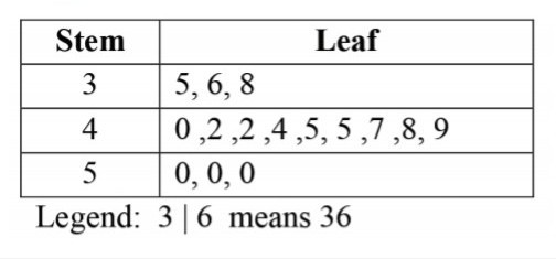
A stem-and-leaf plot shows the shape and distribution of data. It can be clearly seen in the diagram above that the data clusters around the row with a stem of 4. It is some how normal(ie most data is at the centre and a few towards the ends).
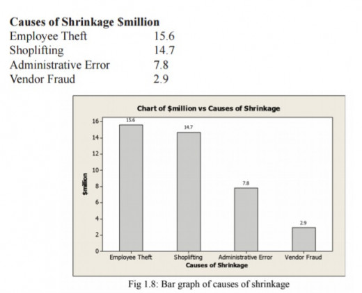
Bar graph
It is used to show graphical frequency distribution for a categorical variable.
Example
Draw the bar graph for the data below:
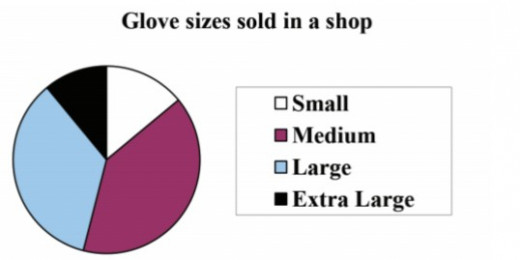
Pie chart
A pie is an alternative display of bar graph
Example
Draw the pie chart for the data in example above.
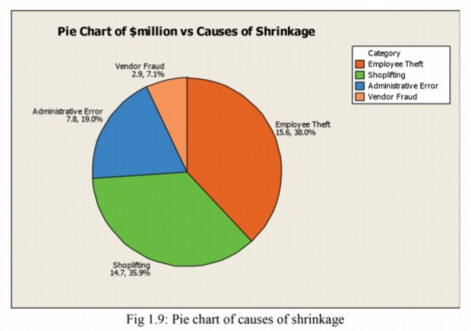
A pie chart is a circle with slices proportional to the relative frequency of each category. A Pie chart is made by representing the relative frequency of a category by an angle of a circle determined by:
Angle of a category = Relative frequency of the category
Relative frequency=f/n
Example
A shop sells different sizes of gloves. The table shows the percentage of gloves sold in a year that were each size
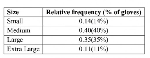
As the values are percentages, the total must be 100% (but check to make sure)
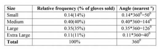
Note: Sometimes rounding the angles leads to a total angle of more or less than 360º.
If this happens, adjust the angle of the largest sector so that the total is correct e.g if the total comes to 361º, take 1º away from the largest angle.
Numerical summaries of data
Measures of central tendency
Definition: Given a series of observations measured on a quantitative variable, there is a general tendency among the values to cluster around a central value. Such clustering is called central tendency and measures put forward to measure these tendency are called measures of central tendency or averages.
Measures of the centre indicate where the center or the most typical value of the variable lies in collected set of measurements. Measures of center are often referred to as averages.
The mode
The sample mode of a qualitative or a discrete quantitative variable is that value of the variable which occurs with the greatest frequency in a data set.
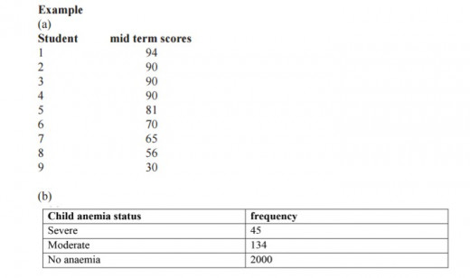
Find the mode in (a) and (b)?
Solution
(a) mode is 90 (b) mode is category no anaemia
Note that for a categorical variable, look at the category with highest frequency and for a quantitative (numeric) variable look at number with frequent occurrence.
The median
The sample median of a quantitative variable is that value of the variable in a data set that divides the set of observed values in half, so that the observed values in one half are less than or equal to the median value and the observed values in the other half are greater or equal to the median value. To obtain the median of the variable, we arrange observed values in a data set in increasing order and then determine the middle value in the ordered list.
If the number of observation is odd, then the sample median is the observed value exactly in the middle of the ordered list. If the number of observation is even, then the sample median is the number halfway between the two middle observed values in the ordered list. In both cases, if we let n denote the number of observations in a data set, then the sample median is at position (n+1)/2 in the ordered list.
Example
Seven participants in bike race had the following finishing times in minutes: 28,22,26,29,21,23,24. What is the median?
Solution
Medium is the middle observation in the ordered list 21,22,23,24,26,28,29 i.e 24.
What it means, half of the observations are less than or equal to 24 and half of the observations are more than or equal to 24(check).


Comments
Post a Comment